Introduction
Hi guys!
I’m Craze😎
You might find it challenging when facing issues about the layout overflow and uneven spacing
I was one of them, spending hours organise the layout, and then the layout crashed when you changed devices😢
If you have not encountered problems like this, you are fortunate✌️
Today, I learned about the Expanded widget which you may have seen before.
This widget is just amazing
Anyway, Let’s begin
Purpose + Sample Code
The Expanded widget can be used in a Row, Column, or Flex widget
This is simply because the Expanded widget is used
- To make a child widget take up all the remaining available space
- To distribute space between children widgets dynamically.
Let’s have a look
1: Making a child widget take up all the remaining available space
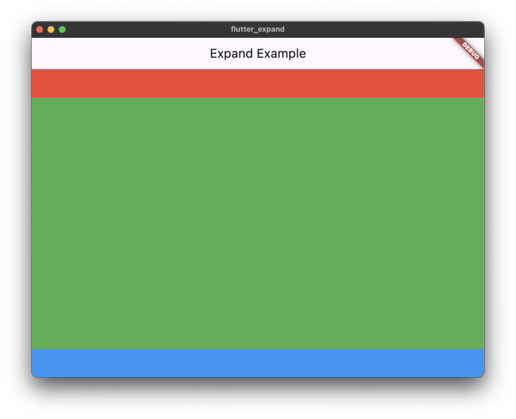
This is what the Expanded widget looks like
In this code, I did not set any space contribution, so it takes up all the remaining available space as you can see on the image
import 'package:flutter/material.dart';

void main() {
  runApp(const MyApp());
}

class MyApp extends StatelessWidget {
  const MyApp({Key? key}) : super(key: key);

  @override
  Widget build(BuildContext context) {
    return MaterialApp(
      home: Scaffold(
        appBar: AppBar(title: const Text("Expand Example")),
        body: Column(
          children: [
            Container(
              color: Colors.red,
              height: 50,
            ),
            Expanded(
              child: Container(
                color: Colors.green,
              ),
            ),
            Container(
              color: Colors.blue,
              height: 50,
            ),
          ],
        ),
      ),
    );
  }
}
2: To distribute space between children widgets dynamically.
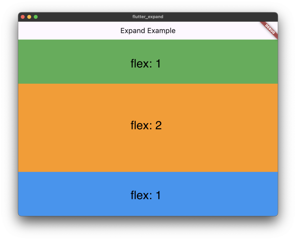
As the second usage of the Expanded widget, helps distribute space between children widgets dynamically.
import 'package:flutter/material.dart';

void main() {
  runApp(const MyApp());
}

class MyApp extends StatelessWidget {
  const MyApp({Key? key}) : super(key: key);

  @override
  Widget build(BuildContext context) {
    return MaterialApp(
      home: Scaffold(
        appBar: AppBar(title: const Text("Expand Example")),
        body: Column(
          children: [
            Expanded(
              flex: 1, // Takes 1 part of available space
              child: Container(color: Colors.green),
            ),
            Expanded(
              flex: 2, // Takes 2 parts of available space
              child: Container(color: Colors.orange),
            ),
            Expanded(
              flex: 1, // Takes 2 parts of available space
              child: Container(color: Colors.blue),
            ),
          ],
        ),
      ),
    );
  }
}
Another Example
Yesterday, I created a password check screen. I added the link, so please check it as well😄
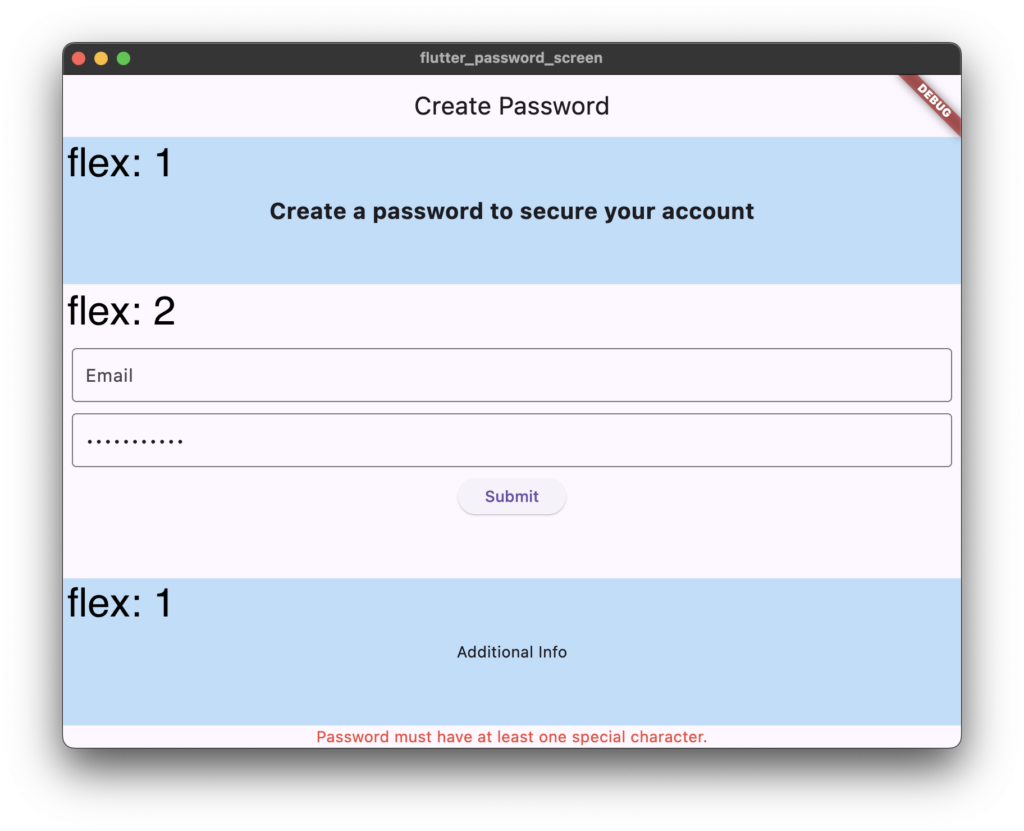
This time, I enhanced my password check screen by using the Expanded widget.
I explained the steps to validate the password in the previous blog, so if you want to see it, check it
In this article, I just show the parts of the code, which include the Expanded widget.
This is the final form
body: Column(
        children: [
          Expanded(
              flex: 1,
              child: Container(
                color: Colors.blue[100],
                alignment: Alignment.center,
                child: Text(
                  'Create a password to secure your account',
                  style: TextStyle(fontSize: 20, fontWeight: FontWeight.bold),
                ),
              )),
          Expanded(
            flex: 2,
            child: Padding(
              padding: const EdgeInsets.all(8.0),
              child: Column(
                mainAxisAlignment: MainAxisAlignment.center,
                children: [
                  TextField(
                    decoration: const InputDecoration(
                      labelText: 'Email',
                      border: OutlineInputBorder(),
                    ),
                  ),
                  SizedBox(height: 10),
                  TextField(
                    controller: _passwordController,
                    obscureText: true, // Hides the password
                    decoration: InputDecoration(
                      border: OutlineInputBorder(),
                      hintText: 'Type your password',
                    ),
                    onChanged: _validatePassword, // Validates as the user types
                  ),
                  SizedBox(height: 10),
                  ElevatedButton(
                    onPressed: () {
                      if (_message == 'Password is valid!') {
                        ScaffoldMessenger.of(context).showSnackBar(
                          SnackBar(content: Text('Password saved!')),
                        );
                      }
                    },
                    child: Text('Submit'),
                  ),
                ],
              ),
            ),
          ),
          Expanded(
            flex: 1,
            child: Container(
              color: Colors.blue[100],
              alignment: Alignment.center,
              child: Text(
                'Additional Info',
              ),
            ),
          ),
          Text(
            _message,
            style: TextStyle(
              color:
                  _message == 'Password is valid!' ? Colors.green : Colors.red,
            ),
          ),
        ],
      ),
Finally
Thank you for reading through my today’s blog post❤️
コメント